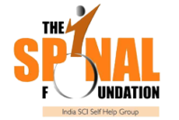
The Spinal Foundation Logo – “I OVERCAME”
Central to the design of the logo of The Spinal Foundation is the intent to convey the positive objective of the organization, of rebuilding lives of people with spinal cord injury, and help them lead fulfilling, successful lives as contributing members of our society.
In designing the logo typeface, a conscious decision was made to make the word “SPINAL” bold and central by using a large font size. The rartionale for this approach was to make sure the focus group of the organization would relate easily and this facet would also be obvious to a larger audience. The “I” needed to rest dynamically on a symbolic wheel and this had to be integrated into the logo typeface. This perspective also drove the larger font for ‘SPINAL”.
The “I” in SPINAL is structured to metaphorically represent a human figure. Shaped like an arrow pointed upwards, it draws inspiration from the famous Usain Bolt style of celebration after every triumph. The I, thus, signifies overcoming disability, rising above all challenges imposed by a spinal cord injury, moving towards empowerment, living a meaningful life with dignity and being victorius in the face of adversity. The human figure reaching out upwards towards the right conveys positivity and ambition.
The first “O” in Foundation is portrayed as an outline of a wheel, and is linked to the I in a dynamic posture, as the wheelchair in most cases becomes an integral part of the life of a spinal cord injured person. The O has a forward tilt signifying motion and energy.
The choice of orange was influenced by the fact that orange denotes courage, and is also a part of the Indian Flag. The colour combination creates a professional, formal and focused look that is integral to the organisation
The tagline ”India SCI Self Help Group” has been encased in a graded version of the orange used in SPINAL to ensure integration of the logo typeface and tagline.
“I OVERCAME” is the message of the logo. This would be a realistic and symbolic representation of how every person with SCI battles challenges to forge ahead in life, difficulties notwithstanding.
The logo is in English as The Spinal Foundation represents the Indian face in the international context, too. It shall be used alongside a transliterated version of The Spinal Foundation in various Indian languages. The Spinal Foundation is sure to carve an identity that transcends barriers of language with the work it shall do.
The creator of the logo for The Spinal Foundation is Paul Athisayaraj Joshua.
Background
Paul Athisayaraj Joshua is an alumnus of Christian Medical College (CMC), Vellore, and has worked for two years at the main hospital campus of CMC. This gave him the experience of working with spinal cord injured, brain injured, stroke victims and children with special needs. In his six-and -half years’ association with CMC as student, intern and staff, he has also used his creative skills for several social causes including extensive illustrations for the WHO Manual on Spinal Cord Injury. At present, Paul is pursuing his post-graduation in Graphic Design at the prestigious National Institute of Design (NID), Ahmedabad, India.


 by
by